


1. TEN HENRYK // LOGO
New personal branding embraces the way I create - through synthesis and focus.
That's why the first of three pillars of the brand - logo - is a condensed form of "TEN HENRYK" name.
New personal branding embraces the way I create - through synthesis and focus.
That's why the first of three pillars of the brand - logo - is a condensed form of "TEN HENRYK" name.
[PL] Nowy personal branding wyraża to, w jaki sposób tworzę - poprzez syntezę i skupienie.
Dlatego pierwszy z filarów marki - logo - jest syntezą słów TEN HENRYK.
Dlatego pierwszy z filarów marki - logo - jest syntezą słów TEN HENRYK.


Logo grid is based on the circle forming "0". All other measures derive from its radius.
[PL] Siatka logo oparta jest na okręgu tworzącym "0". Wszystkie pozostałe proporcje wyznacza jego promień.

2. TEN KOLOR // COLOR
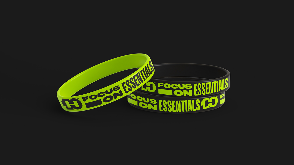
Neon green that refuses to be ignored.
The new hue serves as a brand on its own, no matter what surface it covers.
The new hue serves as a brand on its own, no matter what surface it covers.
[PL] Neonowa zieleń, obok której nie sposób przejść obojętnie.
Nowa barwa działa jako niezależny branding, niezależnie od tego na jakim przedmiocie się znajduje.
Nowa barwa działa jako niezależny branding, niezależnie od tego na jakim przedmiocie się znajduje.


3. TEN KRÓJ PISMA // FONT
Incredibly versatile Owners typeface by @mckltype that boasts a wide range of fonts from XXNARROW to XXWIDE to fit the message on any given surface.
Incredibly versatile Owners typeface by @mckltype that boasts a wide range of fonts from XXNARROW to XXWIDE to fit the message on any given surface.
[PL] Niesamowicie elastyczny Owners od @mckltype, chwalący się odmianami od XXNARROW do XXWIDE dopasowuje przekaz tekstowy do każdego formatu.


THANKS FOR WATCHING!
This personal branding project was created during the 7th edition of Sztuka Projektowania design course by Patryk Hardziej and Oskar Podolski OESU in spring 2022.


